A themable design system built for Pirean’s range of identity and access management (IAM) applications.
Role
Lead Designer
Design team
Simone Salvucci Duncan Wilson
2020 - 2021
As Pirean’s IAM product range grew, design inconsistencies between products we becoming increasingly clear and negatively impacted usability
Two distinct styles
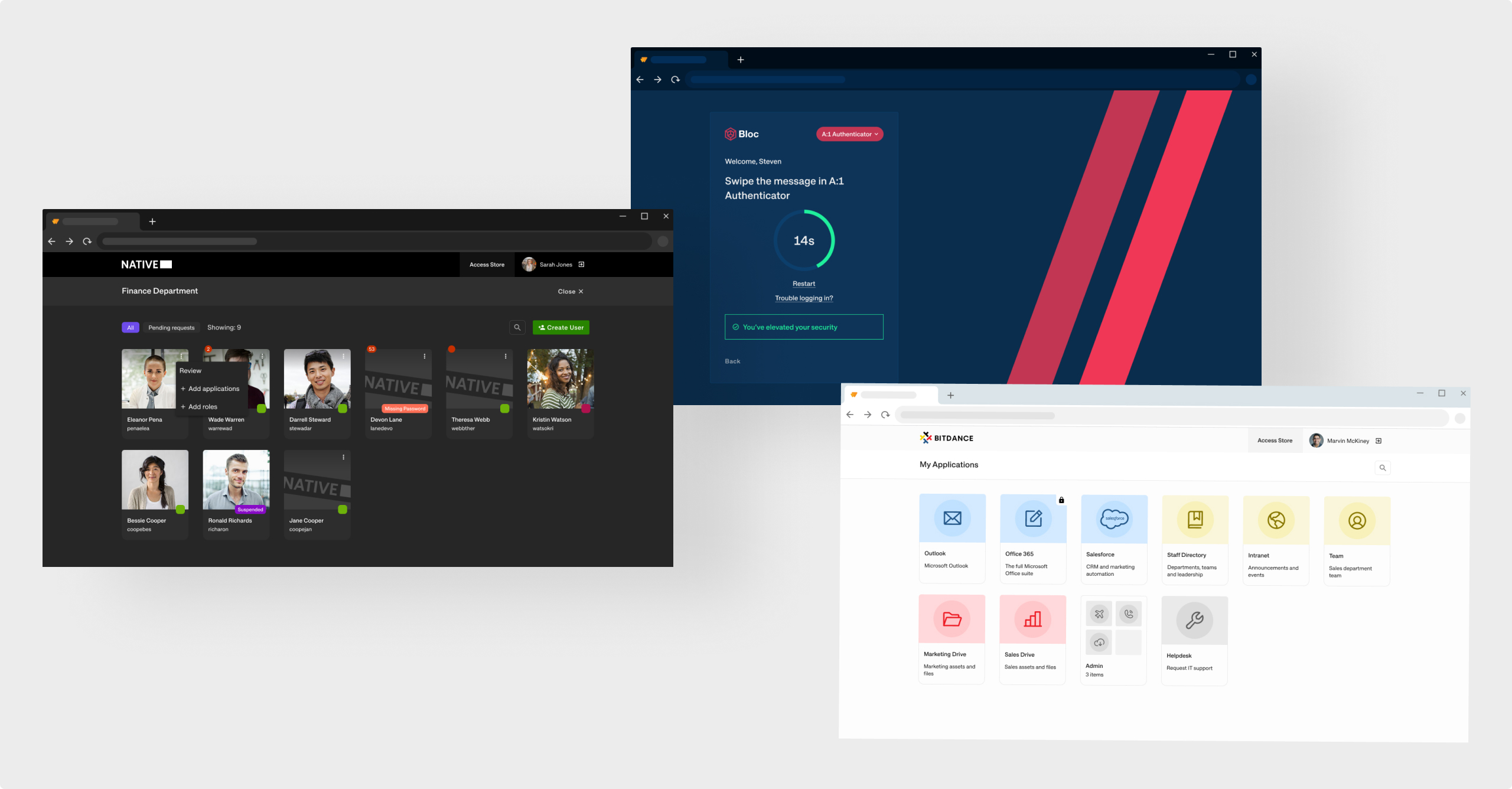
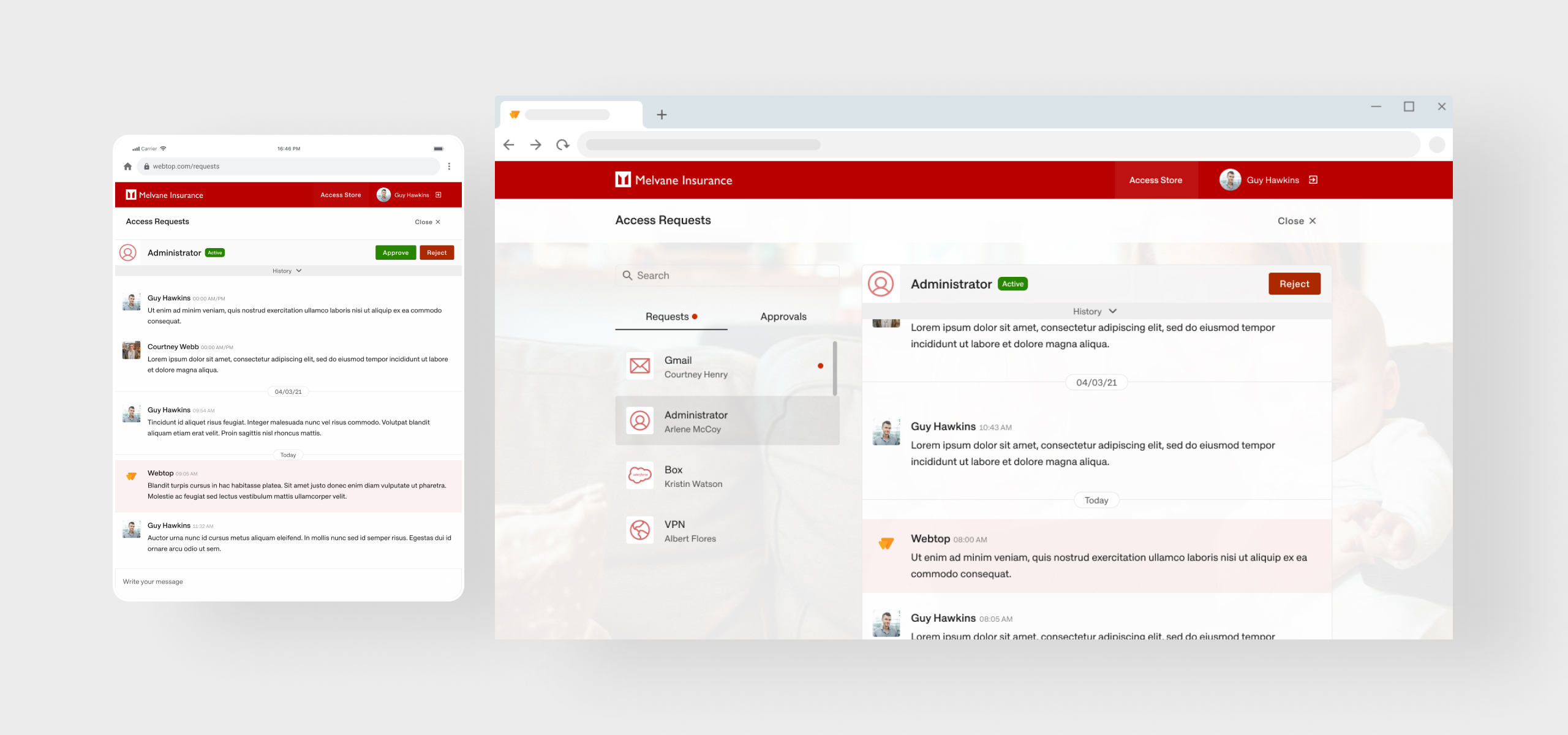
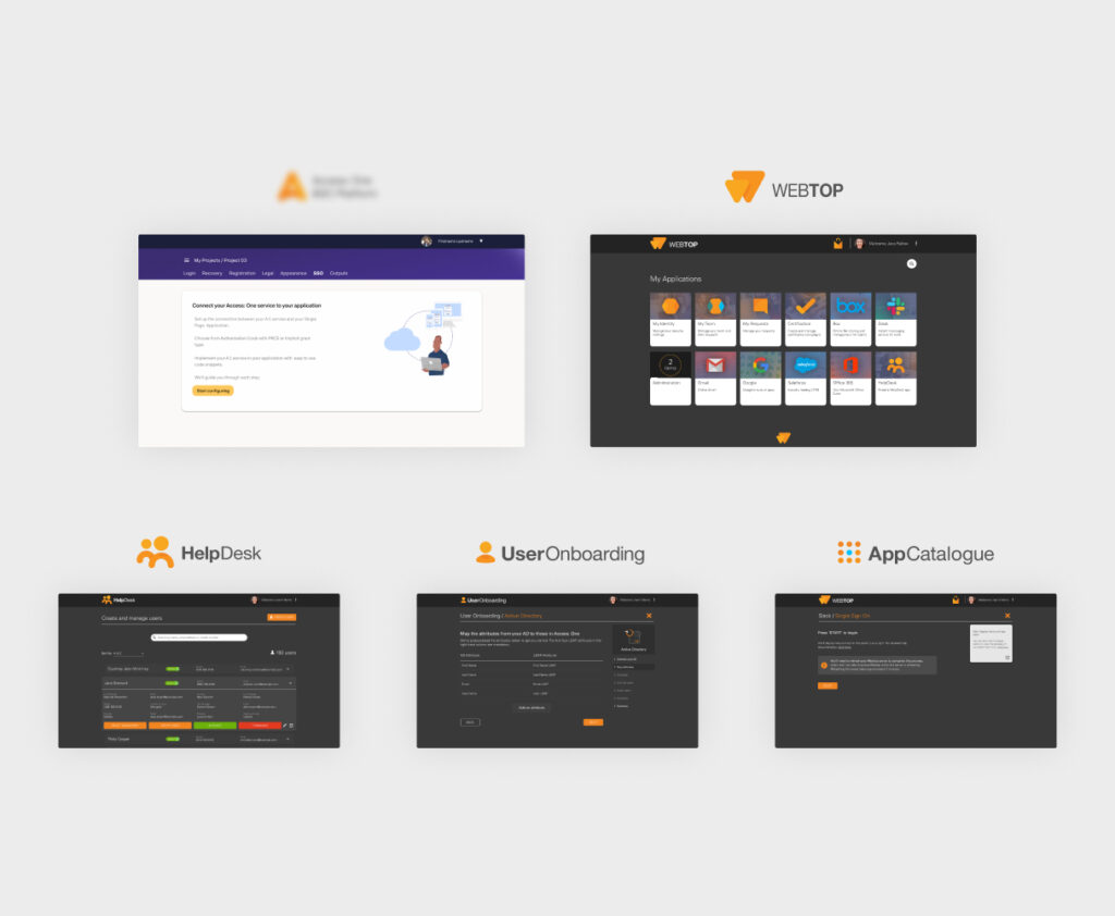
Two of Pirean’s key applications; Webtop and B2C (a code name), had been designed as two very separate products with distinctly different styles.
The rest of the range consisted of smaller add-on applications which could be deployed alongside either of the core applications.
The design team wanted to improve design consistency across the product range in order to create a more cohesive experience for users.
Theming
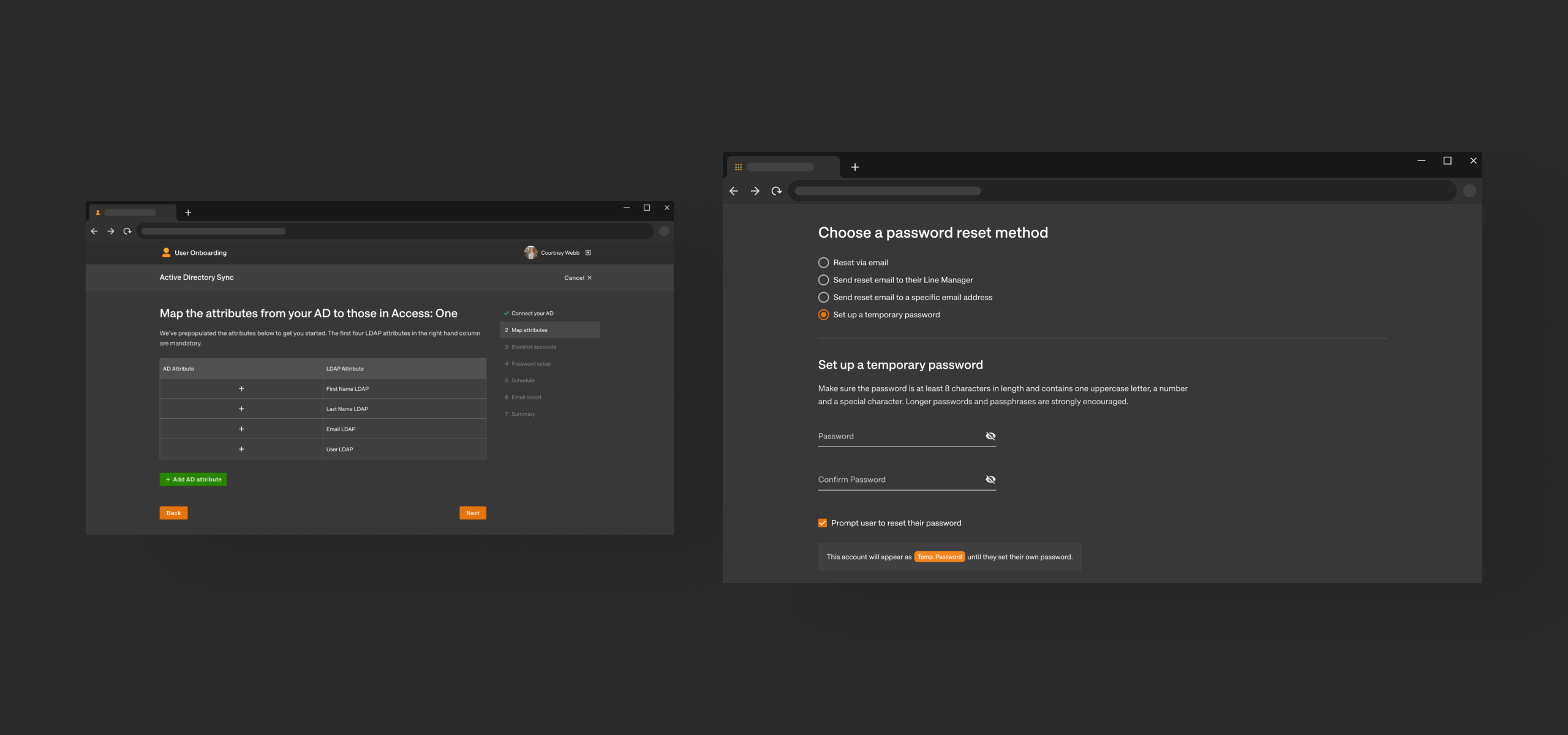
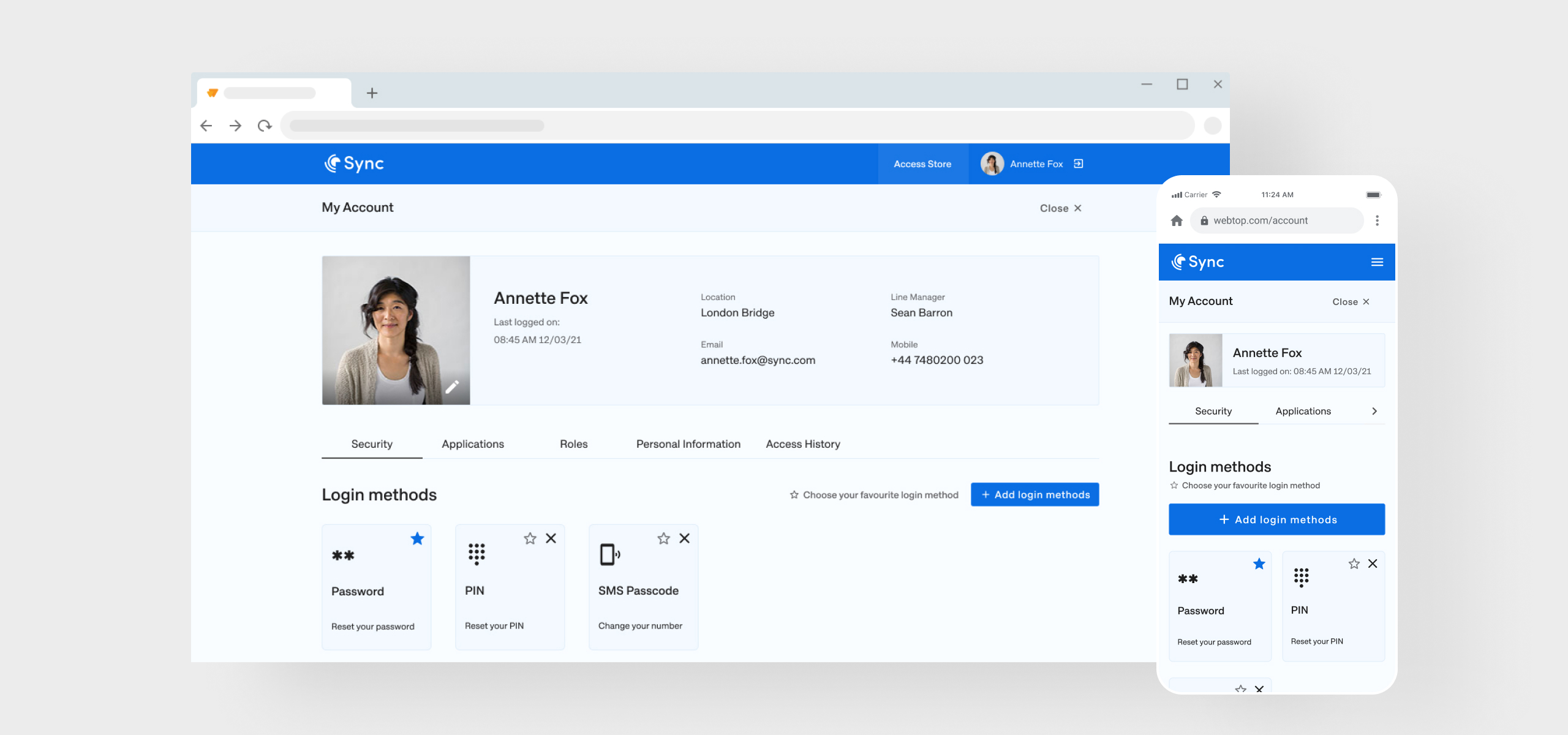
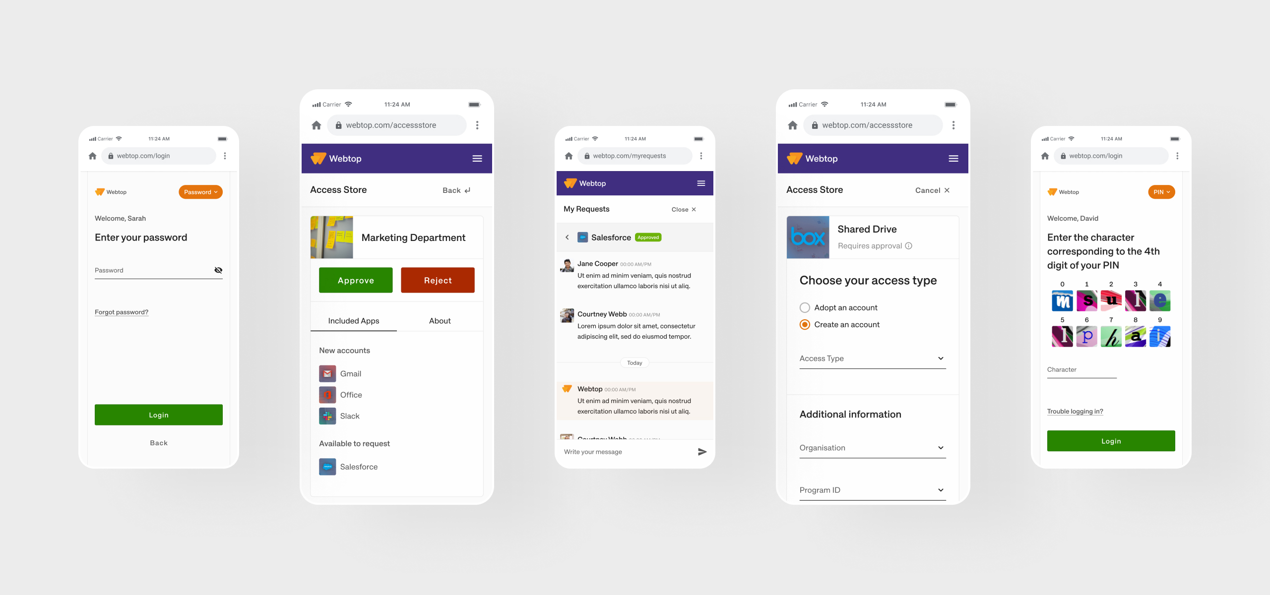
Webtop allows administrators to change its appearance to match their brand. In order for the add-on applications to be consistent with Webtop, they must also be themable.
Though this feature was very popular, it was not very flexible and could easily allow admins to create an interface which was inaccessible.
Solution
Theming is both a requirement and the solution. If we enable theming in the add-on applications, consistency will no longer be an issue. The add-on applications will simply switch between a light and dark theme depending on which application they are deployed with.
This will also give us an opportunity to develop an approach to theming which is not specific to any app, and instead, can be applied to any new application moving forward.
We saw this as an opportunity to create a themable design system which could potentially be rolled out to the rest of our products
1
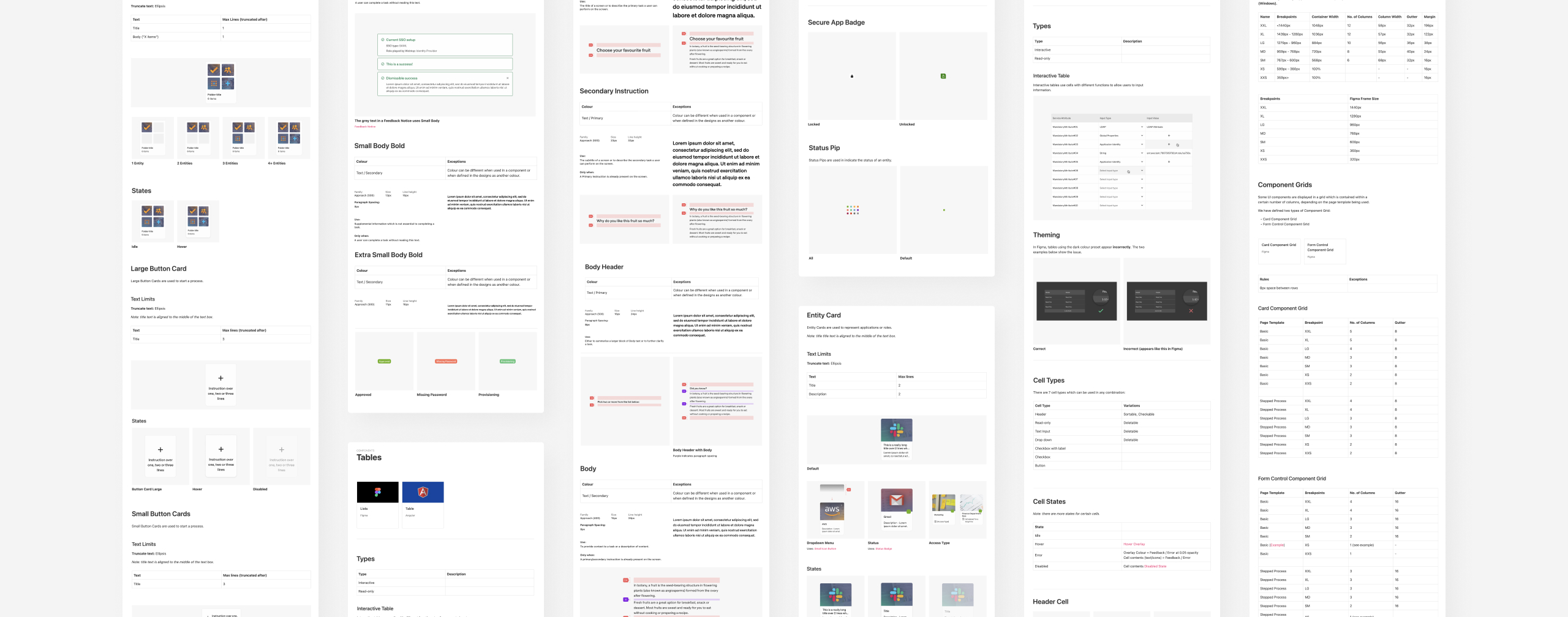
Document current components
This highlighted inconsistencies within the applications themselves, but more importantly, gave us an overview of the developed components and how they interrelate.
2
Audit current journeys
We worked through existing journeys to identify common requirements in page structure and visual hierarchy. Down the line, this enabled us to create page templates and rules on typography use and spacing.
3
Iterate on components and theming
Using Figma, we were able to iterate on a number of different approaches to the theming feature.
Striking a balance between accessibility for the visually impaired and theming flexibility was a key challenge.
4
Document
Zeroheight was used to document expected component behaviour and the foundational aspects of the system such as colour, typography, responsiveness and dynamic spacing.
5
Develop and deliver
While we supported our development team as they built out the initial component library, we produced designs to be used when updating the add-on applications.
During this step, we created documentation templates and guidelines which helped designers to structure their work consistently, making them easy to navigate and digest repetition.
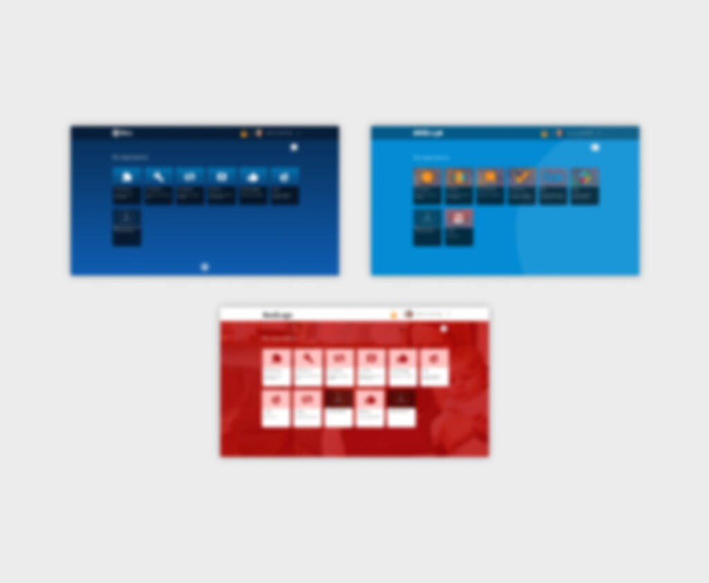
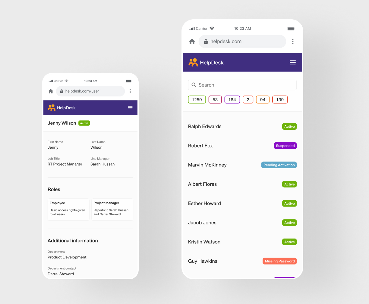
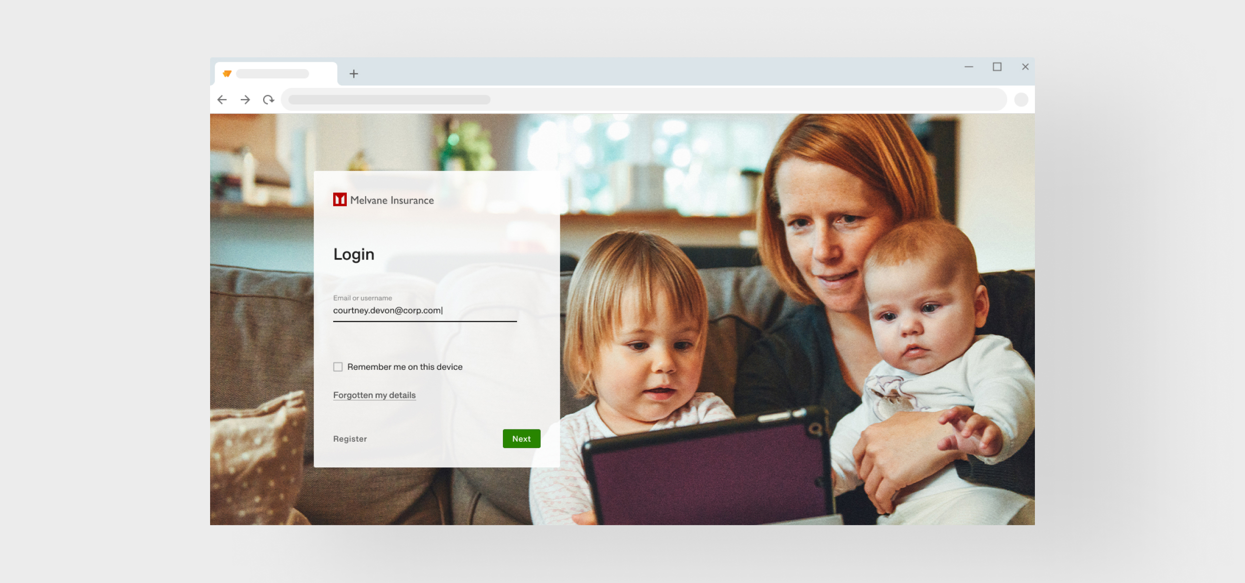
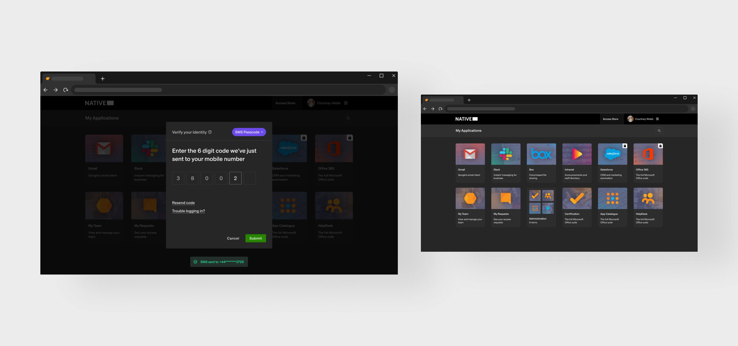
We created default light and dark themes to match B2C and Webtop respectively. Depending which applications were deployed together, the add-on applications would default to the correct theme. Hover over the images to see.
We created default light and dark themes to match B2C and Webtop respectively. Depending which applications were deployed together, the add-on applications would default to the correct theme. Hover over the images to see.
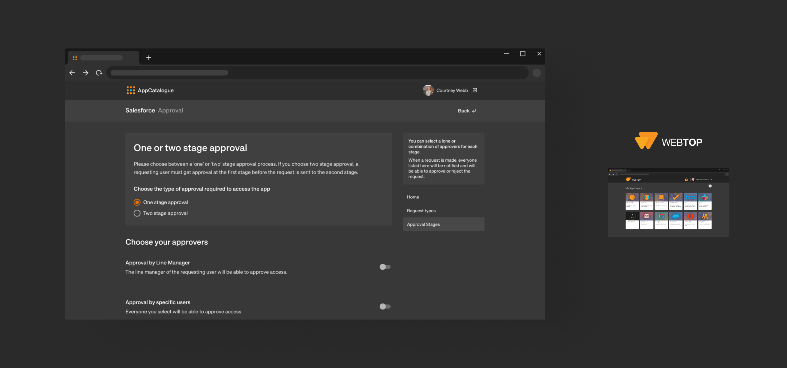
Having established a more robust approach to theming, we began work applying Fabric to Webtop
Webtop is a workforce IAM app which allows large organisations to manage their employee’s access privileges and gives end users one secure login for all of their apps and services.
In order to reduce the likelihood of inaccessible themes (and keep the highly prized ability to use an image as a background), we reduced the number of themable colour combinations in components and introduced non-themable colours in areas we knew could be problematic.
Up next
UI/UX Design
Check out the next best alternative to Facebook events